It was font guru Erik Spiekermann who pointed out that Helvetica, one of the world’s most ubiquitous typefaces should actually have been called Teutonica because of its overwhelming use in Germany. In fact, it’s more of a global font.
“It’s durable. It comes from natural design forms. It doesn’t have an expression of fashion. It has very clear lines and characters, it looks like a very serious typeface,” says Frank Wildenberg, managing director of Linotype, the German firm that owns the font.
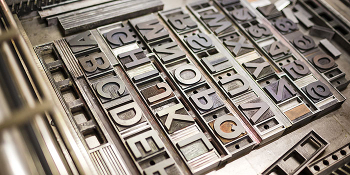
One of the points (no pun intended) about Helvetica is that it’s so common, one barely notices it. In fact, it’s more of a global face. It was the face used to unify the baffling mix of fonts once used on the New York Subway and is quickly and easily read, which is the basic requirement for a sign in a crowded place.
It’s also the natural refuge for the corporate typefaces for many businesses. Its clean lines and impact suggest stability and reliability and lend a timeless, if somewhat neutral flavour, to a brand.