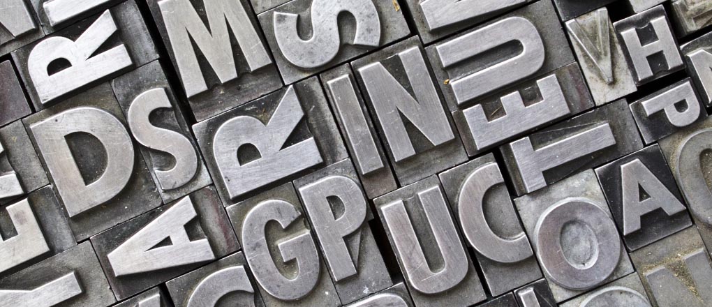
Typography
What’s the point? How to measure type.
Thanks to the wonders of digitisation we now have more typefaces to choose from than ever before and they come in an infinite variety of sizes. But it wasn’t always like this. There was a time when 72 points didn’t quite make an inch and typefaces came in sets of pre-defined sizes. The reason for…
Read MoreFONT ID – How Helvetica conquered the world
It was font guru Erik Spiekermann who pointed out that Helvetica, one of the world’s most ubiquitous typefaces should actually have been called Teutonica because of its overwhelming use in Germany. In fact, it’s more of a global font. “It’s durable. It comes from natural design forms. It doesn’t have an expression of fashion. It…
Read MoreFONT ID – The hounding of the Baskerville
The elegant letterforms of the Baskerville typeface were not widely appreciated when they were first introduced in 1754. The face is best known for its crisp edges, high contrast and generous proportions. It grew out of John Baskerville’s obsession with quality. He developed his own way of working, combining bright woven paper and darker inks…
Read MoreFONT ID – How Johnston’s Underground bridged the class gap
In an earlier post, we highlighted the way that Helvetica has taken over the world as one of the most ubiquitous typefaces, to the extent that it has become almost invisible. Another font that is so widely used that one barely notices it, is Johnston or Johnston Sans – the font used on the London Underground. Originally…
Read More


