Posts by admin
How the world’s worst typo cost $22 billion

In what may go down in history as the greatest printer’s error of all time, Google suffered a rapid $22 billion fall in its share value following an accidental email transmission from its printers. The company’s third-quarter results were prematurely filed with regulators and made available to news wires. In place of an opening comment…
Read MoreBRANDING DISASTERS – Dairy-based haircare

Why take two bottles of yoghurt into the shower? The resplendently coiffed Billy Connolly’s remark about the bewildering variety of shampoo choices: “Where I come from, Jojoba is the month after September and anything with egg and mushroom in it would have gone straight into the frying pan, ” recalls Clairol’s doomed attempt to market…
Read MoreWhat’s the point? How to measure type.
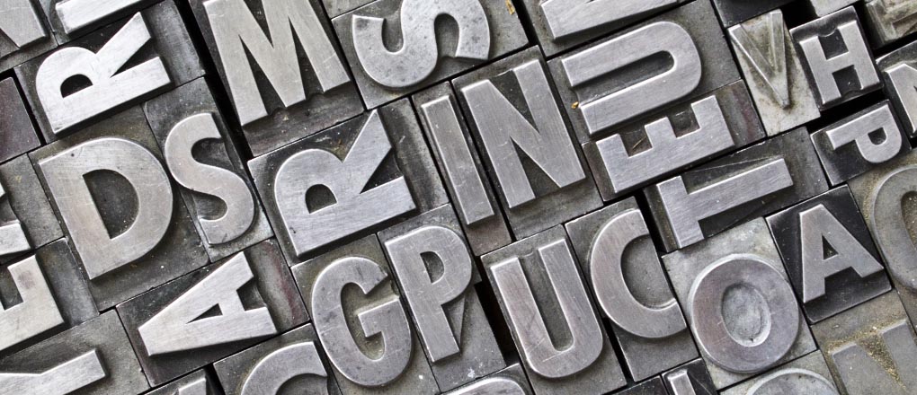
Thanks to the wonders of digitisation we now have more typefaces to choose from than ever before and they come in an infinite variety of sizes. But it wasn’t always like this. There was a time when 72 points didn’t quite make an inch and typefaces came in sets of pre-defined sizes. The reason for…
Read MoreCOPYWRITING – effective rules for clear communication

If you ever struggle over a piece of copy because you think it sounds too familiar, return to George Orwell for help. Best known today for 1984 and Animal Farm, Orwell was a brilliant journalist and essayist. And 70 years ago he published a writer’s tool that was a piece of genius. The joy of…
Read MoreFONT ID – How Helvetica conquered the world
It was font guru Erik Spiekermann who pointed out that Helvetica, one of the world’s most ubiquitous typefaces should actually have been called Teutonica because of its overwhelming use in Germany. In fact, it’s more of a global font. “It’s durable. It comes from natural design forms. It doesn’t have an expression of fashion. It…
Read MoreCORPORATE IDENTITY – Hidden image points the way

Every now and then a piece of graphic design becomes such a common sight that we stop looking at it. How many people notice the hidden arrow in the FedEx logo for example? The subliminal message was designed by Landor Associate’s Lindon Leader in 1994. He hit upon the idea after more than 200 design…
Read MoreFONT ID – The hounding of the Baskerville

The elegant letterforms of the Baskerville typeface were not widely appreciated when they were first introduced in 1754. The face is best known for its crisp edges, high contrast and generous proportions. It grew out of John Baskerville’s obsession with quality. He developed his own way of working, combining bright woven paper and darker inks…
Read MoreFONT ID – How Johnston’s Underground bridged the class gap

In an earlier post, we highlighted the way that Helvetica has taken over the world as one of the most ubiquitous typefaces, to the extent that it has become almost invisible. Another font that is so widely used that one barely notices it, is Johnston or Johnston Sans – the font used on the London Underground. Originally…
Read MoreLife imitates art in logo rebrand

Spurred on by the £30 million it was going to save by taking its “youth-oriented” offering Channel 3 off air and online, the BBC decided that what it needed to do was splash out a large and undisclosed wodge of cash on a new logo. BBC3 has been a victim of the need to cut costs…
Read MoreCLEAR THINKING – Thoughts from the great and the good

There is no reason for any individual to have a computer in their home” Kenneth Olsen, president and founder of Digital Equipment Corporation in 1977 “Next Christmas the iPod will be dead, finished, gone, kaput.” Alan Sugar in 2005 – the iPod went on to sell another 358 million units after Christmas 2005. “There are…
Read More